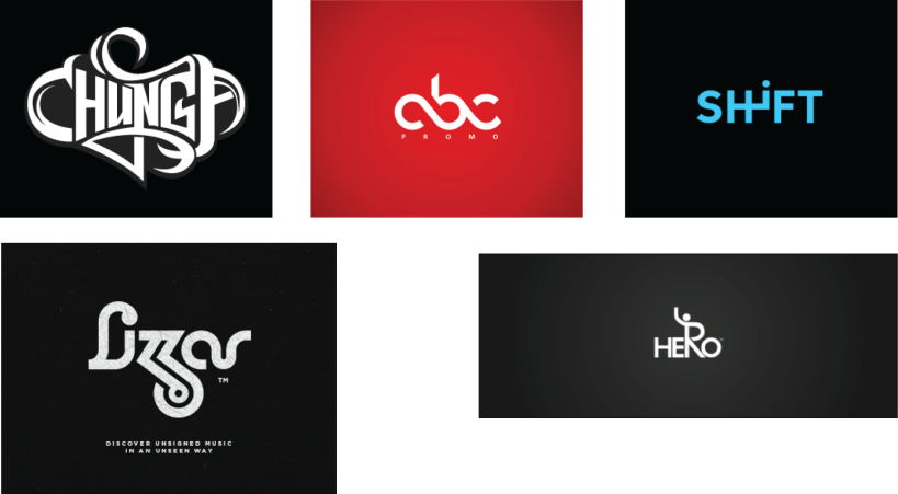
One course I recommend designers take is typography. Probably one of the most essential parts of a logo is the type, not the design. If your design has typography that doesn’t fit the design, then you won’t have a job for very long. Or you could just become one of those boring people who instead of taking some risks with their typography, and just go with the same Serif or San Serif fonts. However, if you want to stand out as a designer, whether working within an organization or a small business owner; you’re going to have to step out and do something that will get the eyes of everyone who sees your design because the idea is to get people to notice your client.
Rule of thumb, if the client knows what they want, design it for them. However, if the client is clueless about what they want for a logo, or a logo change; I say start with the typography. It just might be the logo they’re looking for. This will also save you time in designing for them, and save them money, which is what company’s like to hear. Make a selection of visual logos and some typography logos and see what they like best. But make sure within your visual logos that the type goes well with the design. My point…don’t be boring. It’s a good idea to start making some good typography logos.
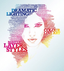
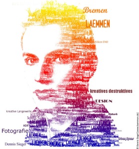
 Another great idea is a little bit more time consuming and takes a lot of patience. However, it is a great piece of work to display in your portfolio. I recommend using the type tool in Illustrator to do a project like this. If you click and hold down on the type tool, you’ll see the “type on path tool” or “type in area tool.” Both can be used for making a compelling piece of typography artwork.
 The process is…go find a picture you like. Usually, you should start with a portrait, but it doesn’t have to be that way. Take your photo into Photoshop and make it black and white. Then take the black and white photo into Illustrator. Next, lock it on the art board and begin using the pen tool. Outline an area of the picture, and then go to the type tool and select “type on path.” Be sure you use a font that isn’t boring. If you don’t have a lot of fonts on your computer, you can always go to dafont.com or fontsquirrel.com and get some free fonts for personnel use. There are some that are free for commercial use as well, but check for that if you’re unsure. If isn’t clear whether or not you can use if for commercial use, they just don’t use it for commercial purposes.
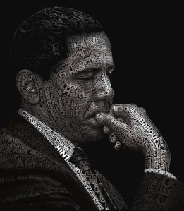
 Once you’ve downloaded some awesome fonts and installed them, they’ll show up in Illustrator. Now use creative fonts on the type path or type within an area to see what it will look like. You don’t have to worry about creating words, unless you want to get really elaborate like the this Obama example. It will take more time, but as you can see the results afterward are an awesome design. If you’d like to see more examples, just do a google image search and look up typography.
 Make sure as you design everything in the typography artwork that you’re using black fonts for shadows and white fonts for light areas. To make things easier, do the opposite while you’re designing an area. Just don’t forget to switch them back when you’re finished. If you plan on designing a color typographic piece of artwork; I recommend designing it in black and white first. That way you’re not getting confused about where your lights and shadows are in the picture. Once you are done typing out the design; delete the image behind it and create a gradient or solid background. You’ll be looking at time well spent.

